Mastering the Art of Color Coordination: A Guide to Choosing Harmonious Hues
Color is a powerful tool in the arsenal of any designer or artist. It can evoke emotions, create visual impact, and communicate messages without a single word. But with great power comes great responsibility. Choosing colors that work together is not just a matter of taste; it's a skill that can be learned and refined. In this blog post, we'll explore the principles of color theory, practical tips for color coordination, and how to apply these concepts to various fields such as interior design and graphic design to achieve visual harmony.
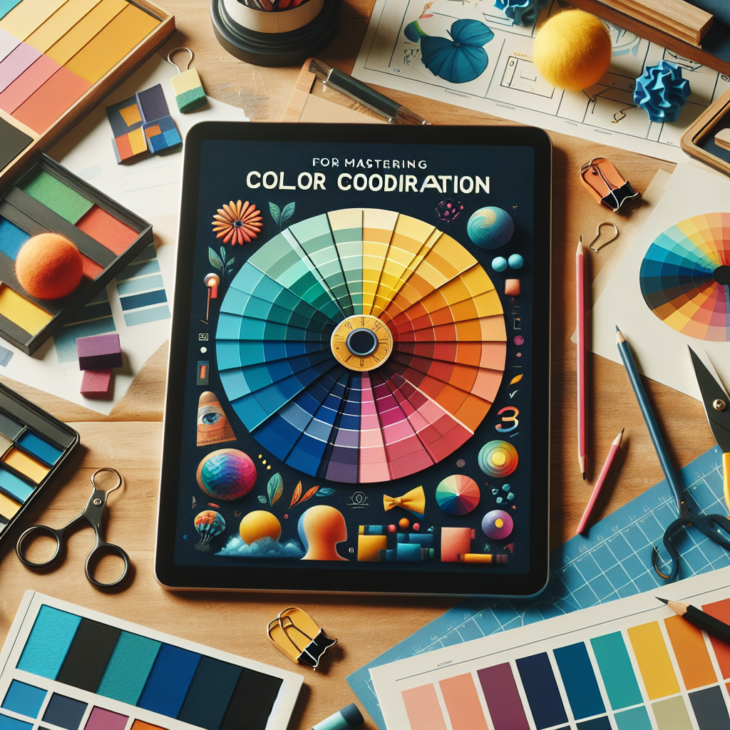
Understanding the Color Wheel
The color wheel is the foundation of color theory. It's a circular diagram that represents the relationships between colors. The wheel is typically divided into three categories:
- Primary Colors: Red, blue, and yellow. These colors cannot be made by mixing other colors.
- Secondary Colors: Green, orange, and purple. These are created by mixing two primary colors.
- Tertiary Colors: The result of mixing a primary color with a secondary color, resulting in hues like red-orange or blue-green.
Understanding the color wheel is crucial for creating color schemes that are pleasing to the eye.
Color Harmony: The Key to Aesthetic Appeal
Color harmony refers to the aesthetically pleasing relationships between colors. There are several types of color schemes based on the color wheel that can help achieve harmony:
- Complementary Colors: Colors opposite each other on the color wheel. For example, blue and orange. These create a vibrant look when used together.
- Analogous Colors: Colors that are next to each other on the wheel. For example, blue, blue-green, and green. These create a serene and comfortable design.
- Triadic Colors: Three colors evenly spaced around the color wheel. For example, red, yellow, and blue. This scheme is popular for its strong visual contrast while maintaining balance.
- Split-Complementary Colors: A variation of the complementary scheme, it uses one base color and the two colors adjacent to its complement. This provides high contrast with less tension than the complementary scheme.
- Tetradic Colors: Four colors arranged into two complementary pairs. This scheme offers plenty of possibilities but requires a good balance to be effective.
The Psychology of Color
Color psychology is the study of how colors affect perceptions and behaviors. For instance, blue is often associated with calmness and stability, while red can evoke feelings of passion and urgency. Understanding these associations can help in choosing colors that convey the right message and mood for your project.
Applying Color Theory in Interior Design
In interior design, color can transform a space. Here are some tips for choosing colors that work well together:
- Start with a Color Scheme: Decide on a color scheme based on the color wheel and the desired mood for the room.
- Consider the Room's Purpose: Different colors can influence the atmosphere. For example, blues and greens are great for bedrooms because of their calming effect.
- Use the 60-30-10 Rule: Distribute colors in a ratio of 60% for the dominant color, 30% for the secondary color, and 10% for the accent color to create balance.
- Test Your Colors: Before committing, test paint swatches in the room to see how they look in different lighting conditions.
Graphic Design and Color Coordination
In graphic design, color can make or break a design. Here's how to use color theory effectively:
- Understand the Brand: The colors should align with the brand's identity and the message it wants to convey.
- Contrast for Legibility: Ensure there is enough contrast between text and background colors to make the content readable.
- Limit Your Palette: Too many colors can be overwhelming. Stick to a few colors that work well together to maintain coherence.
Tools and Resources for Color Selection
Several tools can help you choose colors that work together:
- Color Wheel Apps: Digital color wheels that allow you to visualize different schemes.
- Color Palette Generators: Online tools that generate color schemes based on your input.
- Design Software: Programs like Adobe Photoshop and Illustrator have built-in tools to assist with color selection.
Practical Examples of Color Coordination
To illustrate how color coordination works in practice, let's look at some examples:
- A Brand Logo: A company selling eco-friendly products might use green to represent nature and sustainability, paired with brown to evoke earthiness and reliability.
- A Website Design: A tech blog could use a monochromatic scheme with shades of blue, suggesting professionalism and trustworthiness.
- Home Decor: A living room with a neutral beige as the dominant color, accented with vibrant teal throw pillows and curtains, creates a warm yet dynamic space.
Final Thoughts on Choosing Colors That Work Together
Selecting colors that work well together is both an art and a science. By understanding the basics of color theory, the emotional impact of colors, and the principles of color harmony, you can create designs that are not only visually appealing but also effectively communicate your intended message. Whether you're decorating a home, designing a website, or creating art, the right color choices can make all the difference.
Remember, while rules and guidelines are helpful, don't be afraid to experiment and trust your instincts. Sometimes the most striking color combinations come from thinking outside the color wheel.


